Cornelia and CO
Oriol Gil
I really love the design of these products and the strength of them as a set. The colour palette it very strong and the use of brown paper and card really lends itself to the aesthetic look. Print has been incorporated very subtly but is a great asset to the overall look. Varied type faces has been used but because the rest of the design is so simple it works well and adds some interesting variation. There has been great attention to detail which gives a very professional finish.
Benedict
Orit C
This design has an interesting take on incorporating the picnic blanket itself into the packaging, although I feel this is something I won't do as I think it makes it look slightly messy. The branding itself is strong and I like how pattern has been used as a theme for each. The structure of the box is also very clever, this is an aspect we will have to really consider in order to have a successful end result.
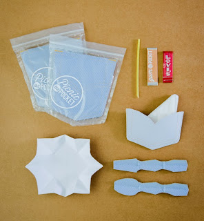
Picnic in a Pocket
Sapir Akerman
This is a very quirky project that really caught my eye and although I feel this is a concept I wouldn't take on myself I still appreciate it's quirkiness and shows how creative you can be. The idea is very strong and I like how they have focussed on making something that is easy for the audience to carry and isn't a heavy burden. How all the aspects fold down also helps them to fit in the pocket pouch.


No comments:
Post a Comment