Gucci
The use of a bronze stock alone gives a luxury feel, especially when it is paired with the gold tone type. The collection of products has a very consistent style that I feel has to be done to retain this look. The texture on the stock is also really interesting and is an attention to detail that really exaggerates the high end look.
Chanel
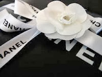
The black and white colour scheme of Chanel is very iconic and the contrast of these tones has a lot of impact. The use of the ribbon works well as the crisp white looks great against the dark black. The use of the flower also adds another decorative aspect.
Louis Vuitton
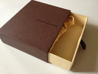
I don't think brown is a choice I'd make for Galina London but it links well with the Louis Vuitton brand. I love how spot varnish has been used as it allows the text to be in the same colour yet still be visible and in different lights gives off varied effects. The structure of the box in the top images also interests me, I like how it pulls out in a more unconventional way for a gift box.
The almost complete use of white used for Dior gives a very bright, crisp appearance. Also because the colour is very easily imperfected it gives a greater urge to the consumer to look after the product and packaging in order to keep it in the pristine condition. The use of ribbon has a different effect than with Chanel as it doesn't contrast with the boxes at all and has a more subtle look.
I love the powder blue of this packaging as I feel it stands out from the rest whilst still retaining a high end appearance. I think this pastel colour shade is something I may experiment with myself as I like the fun use of colour but in a more expensive way.
Jimmy Choo
This pastel pink is also a successful shade and I like how it has been incorporated with the metallic gold type. The pink hints at a feminine look without being overbearing and sickly.


No comments:
Post a Comment