Sunday, 29 December 2013

Cath Kidston - Current Design Research.

Within the Cath Kidston brief it was stated that the new pattern to be designed had to be a 'conversational print' with a similar feel to some of their current designs like cowboy, garden birds, and standing guards. For the beginnings of my research I have decided to look into these and a few others more closely.

Cowboy


I feel that this print is really fun as I like the sense of action with the composition and the bright colours used. This design is so unique which is why I think it would be very memorable and interesting to look at. When creating my own design I think it would be good to do something as exciting and different as this. These examples also show how the pattern can be applied to a variety of products, either as a repeat or a stand alone image.


Garden Birds


I feel this bird design is more similar to Cath Kidston's usual style, with it's links with nature and the countryside. I like the texture that has been created with how the paint has been applied as it adds another lever to the print. These examples show how a variety of colour ways can be applied to the same design, this is helpful to see as it something I will have to do myself.


London Scene


I think that this London Scene is one of my favourite prints in the collection as I really like how all the landmarks have been portrayed in this style of illustration and link within the composition. Again different colour ways have been produced and also with these images it is demonstrated what a large range of products the pattern will need to be applied to. This tells me that it needs to be able to work within a large ante of layouts.


 Circus


This is another playful approach to pattern, with a very interesting subject matter that wouldn't normally be considered for this kind of design. The colours within this piece are made up of pastels which is different from the rest of the prints. The scenes that have been illustrated are all very engaging and would work just as successfully as a stand alone print.


Vintage Cars


I really like the movement illustrated within this design and how it leads your eyes across the composition. The colours chose are more dull, but I think that this is a suitable choice for the subject matter. This has led me to think that I will have to think carefully about the tones I use to assure that they are appropriate and do the print justice. The colours chosen could also determine what type of audience would be interested in it.


Standing Guards


This is the most graphic of the selection, it appeals to me as it most similar to my style of illustration. I like how even though the cards appear to be very alike there are slight changes that make them unique and give them a personality. This print has been applied to children's clothing this interests me as I think it would be another route I could go down with my designs.

YCN Brief - Champneys.

YCN Brief - Cath Kidston.

Sunday, 15 December 2013

Alternative Christmas - Evaluation.

During this brief I definitely improved being able to work towards a very small timescale, due to it being a very quick turnaround I had to think on an idea and execute it very quickly. Initially it was slightly stressful but as I got into the swing of it I became more comfortable with the situation.

I have learnt that being involved in projects that are for a good cause like this is very rewarding and it is nice to be able to put my skills towards something that can help others. This is definitely something I would like to continue doing in the future. Even if it was organising the whole project like Lizzie and it was great that she took time out to do something so positive.

To gain some inspiration I looked at current Christmas designs on the market and as initially I hadn’t decided whether I wanted to work with type or image I gathered research of both examples. Some took a more traditional kitsch approach whereas some were a lot more contemporary using geometric shapes. I also read up on the lyrics of the song. Before this project I had limited knowledge or riso printing but from my research I learnt that it is very affordable which therefore makes it favourable for experimentation and popular with young designers.  

A strength I can draw from this project is the strong link with the outcome to the original song. I feel that even without words it would be clear to an audience what the illustration is depicting. The design also fits with the rest of the collection.


In order to develop the brief further I could have extended the range from the postcard to a selection of gift material like cards and wrapping.

Elmwood - Final Designs.

Here are some examples of my final designs of main and supporting material. Starting with the initial business cards that sparked the design aesthetic for the rest of the products.


As a way of attracting continued custom this loyalty ticket was created as it entices the customer to return to the brand as a way of saving money in the future. As a way of continuing the theme it has also been designed in the style of a vintage ticket, with language the audience would associate with this. For examples 'admits one' and 'earn a free ride'. The visual style has been continued to create consistency for the brand identity.


As a supporting item I have designed these in car air fresheners with scents that the audience would associate with the fairground. Therefore increasing the sense of an overall experience in the taxi journey. The smells could also be linked with positive memories the customer may have, therefore taking them back to that time.


Finally a very memorable vehicle design has been created. The bright red would be iconic for the brand and would stand out a great deal on the streets making it easy to spot and flag down. The branding has been applied in the same place that I found is common in order to create some familiarity and consistency.

Saturday, 14 December 2013

M&S Picnic - Evaluation.

During the process of this brief I feel I have improved my collaboration skills by working with another individual. I found that I really had to focus my organisation so that what I was doing was in sync with Beth. I also had to learn to compromise because even though we agreed on nearly everything there was the odd decision that we had differing views on. Because we relied on each other to get certain jobs to done it was very important that it was done on time. I also developed my skills in Illustration as this was a big aspect of the aesthetics. To help this progression a lot of research was done for reference material. Initial hand drawn experiments definitely helped.

The initial research that took place was gathering primary images of current products within the Marks and Spencer’s store so that we could have a strong idea of the aesthetic they are known for. I found this really helpful and we found that the illustrative approach really appealed to us and would link with our chosen theme. In regards to the theme we also had to investigate into food and design aspects associated with Scotland. We also looked into current picnic designs and general food packaging this was helpful in terms of thinking of interesting and relevant formats. Finally was illustrative research, this was extremely beneficial as our final style was strongly inspired by the examples we had found.

I think a strength for this brief would be the illustrative scene and how all the products fit together to create a composition. The logistics was quite hard to arrange but I am glad we persevered as I feel it really paid off and created and exciting and interactive format for the audience. I am pleased how the packaging works as a stand alone design as well as a whole scene. Another strength would be the overall style of the design. I am glad we didn’t go down the route of traditional Scottish aesthetics such as tartan and blue and white as the bright tones and contemporary illustration gives an up to date appearance.

I think some weaknesses within this brief was that the we could have incorporated more M&S branding such as a logo or specific copy, however I don’t feel this is a major problem as these could be added.

Elmwood - Design Development.

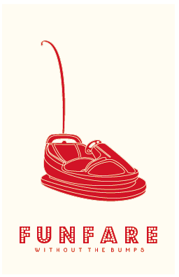
After help from the interim crit and further research I have developed the aesthetic of my idea. I have decided to continue solely with the bumper car illustration as it links most strongly with the area of business and also is consistent with the new saying 'without the bumps'. I also felt that one image would work most successfully as it creates a stronger brand identity.

I initially looked at altering the type from the previous designs. I picked this particular type as it is clear to read whilst giving a modern approach to funfair typography. I also experimented with colour looking at the bright theme as well as the red on off white, which was ultimately chosen as the most successful.


I then thought that the composition could do with an outline to enhance it. I felt that the thinner line gave a slick appearance that I really liked, however I thought back to the interim crit where I was advised to go all out with the theme and really push it. This is why I decided to continue the aesthetic of the lights.


Next I moved onto the reverse side where I decided to inver the colours. I continued with the type style and layout of the initial logo for the copy. Initially I had the company number within the light box however I felt this was unsuccessful so I continued with the light border instead.

Thursday, 12 December 2013

Alternative Christmas - Final Boards.

Galina London - Evaluation.

Through this brief I have improved my skills in working for a real life client, even though I didn’t have actual interaction with the brand I was still creating something that was for a company that I hadn’t specifically created for the brief. Because of this I really had to think about what the brand stood for and their current collection of products. Thinking of this influenced a lot of the decisions I made especially in regards to the designing of the logo. I also developed my laser cutting skills by using it for different tasks such as the cutting out of packaging and also experimenting with new materials like the velvet.

My research for this brief circulated around getting to know the brand so that I could produce the most relevant outcomes, as I wanted something that could instantly be recognised. I also looked at general shop paraphernalia to get an idea of what gift options I would need to create and also more innovative ways of doing it that would be more interactive and memorable for the audience. After my initial designs I felt the aesthetics could be developed further so my research flowed on to looking at more luxury brands and what techniques they use to have that association.

I think a strength for this brief would be development and experimentation. The logo went through quite a few options before I was happy with the end outcome and I really enjoyed the development process. I think I did this more than normal due to the fact it was for a real company. I also enjoyed experimenting with new materials such as the velvet, in regards to the laser cutting and how I could incorporate it into the product format. Such as the layered labels etc.


I think some weaknesses within this brief could be that I could have extended it slightly further by producing mock-ups of the shop itself. I also feel the photography could have been improved by taking shots of the products in context so that it was easier to understand.

Wednesday, 11 December 2013

Alternative Christmas - Printed Postcards.


Galina London - Final Boards.

M&S Picnic - Final Boards.

Elmwood - Funfair Type Research.

From the interim crit it was suggested that I should push the funfair theme further so I have decided to research into funfair typography and the general aesthetic to see how I could incorporate into my own designs.

One style that was common was the decorative and exaggerated serif that takes the letter shape to a new level. The characters themselves are usually very bold to accommodate the additional decoration. As well as the outline a lot of these examples also have patterns incorporated into the inside as well. I find this very interesting aesthetically, however I feel when printed on a small scale like a business card it could become quite illegible.


Three dimensional effects have also proved to be quite common with the letter being given the hint of a structure as well as strong drop shadows. I feel that this technique would be easier to use as the shapes have been simplified yet the detail can still be added with a gold shadow effect.


Pastel and bright colours have been a a reoccurring theme and I like the strong contrast they have. I think this style is extremely effective within the environment it is meant for, although I believe that if it was applied to the taxi sector it could be a bit over the top and unnecessary.


Finally I love the aesthetic of fairground lights, especially when incorporated into typography. I think this would work within what I'm doing as the bold characters will be legible and the light effect could easily be incorporated, as demonstrated in the editorial piece with a typeface I have already experimented with. From these images I have also sensed a strong colour palette of reds and whites, I find this extremely effective as it hints to the fairground look whilst still being tasteful.