
Friday, 31 January 2014
Saturday, 25 January 2014
Thursday, 23 January 2014
Elmwood - Studio Visit and Pitch.
As part of this brief a selection of students got chosen to take their 'brand the boring' pitch ideas and present them at the Elmwood studio in front of a couple of their designers. My idea was lucky enough to get selected along with six others. Initially I was very shocked as I hadn't expected it due to the high level of competition from others on the course, however I was also very excited.
It was arranged that we would meet as a group at the studio where we had a quick tour around the building. I was very surprised at how large it was inside as from the front it looked like quite a small space. I loved the large open spaces and how there was a variety of different spaces for people to work. On the walls and placed around were examples of previous work that was really interesting to see.
After looking around we moved to the conference room and took it in turns to present our boards and idea. I found surprisingly when it came to my turn that I wasn't as nervous as expected and I felt confident in what I was speaking about. I feel like this is because if the relaxed atmosphere and also due to the experience I have gained presenting from my time on the course. I felt that I spoke about my idea clearly and enthusiastically.
After each of us had finished there was a short discussion about our work, positives and improvements that could have been made. The feedback I received was that my overall theme was very strong and the unique quality would be very appropriate and exciting for the audience. It was also said that the supporting elements were very relevant and fit the fairground idea well. Some improvements that were suggested mostly revolved around the choice of type, as it was felt that it could have been more carefully considered.
Overall this was a hugely beneficial and exciting experience for me. Not only to be invited into an award winning international studio and to be able to see and experience where they work, but also to present my work to working professionals and get valid, helpful feedback. I found that this experience has given me confidence in that my work had be chosen for this stage and also that I can present confidently in front of new people.
Wednesday, 22 January 2014
Cath Kidston - Seaside Design Inspiration.

The muted pastel colours on this design really appeal to me aesthetically and I feel they coordinate well together. The shapes used are simple but I like how detail has been incorporated through subtle texture and linear patterns. The white space is good for the composition as it allows the audience to see the design clearly.


Michelle Masons prints are very engaging as there is a lot going on and the colours are very bright and bold. I think these demonstrate how busy, scenic designs can still work well within a home environment. I think the use of simple shapes to create the scenes is a good technique as it doesn't overpower the composition.


I really like the full effect of this print and how all the aspects interlock together with the help of smaller patterns and illustrative items. The colours are very vibrant and these types of tones really appeal to me. Studying designs like this brings me new ideas as to what I could include in my own pattern design, for examples sunglasses, umbrellas etc.

I like the vintage appearance of these prints which I think is supported by the illustration style and colour palette. I think a design like this would appeal to the Cath Kidston audience because of these qualities. By viewing these two examples it also gives me inspiration on how to create multiple colour ways, which is a factor of this brief.


These examples are more art pieces than workable prints but I still felt they were extremely relevant for my research. I find the scenes really interesting as there is a lot going on, but I feel when it comes to designing my own patterns individual illustrations would work a lot better for what I am trying to achieve.


These are cross stitches but I really like the style and feel they are relevant to my work. Because of how they have been created they have an extremely quirky style that really appeals to me. The shapes have also been simplified because of this which I think adds to the interesting look. They type also works really well and I feel links very strongly with the seaside theme.


This design is predominantly for packaging but the style of illustrations still really links with the pattern aspect. I find the colour scheme really interesting with it being predominately blue with hints of contrasting tones to add and highlight detail. There is also subtle texture which helps the piece to come alive and reflects the rugged subject matter.


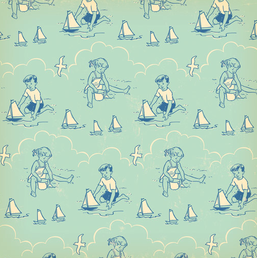
This design focuses on a different part of the seaside that other designs haven't looked at, the pier. The structure has been made using simple shapes that have been highlighted with use of colour. I like how the rides have been incorporated into the composition but I wonder whether this will be relevant to the traditional theme I will be working with.
Tuesday, 21 January 2014
Cath Kidston - Medieval Design Inspiration.


Catherine Sazytch
These patterns represent the medieval theme really well and I like how the varied aspects interlock together. Although I feel that this particular illustration style won't work with the current Cath Kidston look because of the sharp angular lines and the dark, murky colour palette. It also has a more masculine feel that wouldn't work with their target audience.


Jolly Edition
I love the illustrations done by this company, here is an example of a medieval style wedding invitation. The theme has been portrayed with a much more subtle approach and is a lot more feminine. I like the soft lines of the illustrations and also the bright colours that really enhance the design. Medieval style type has also been incorporated, which is an interesting idea.

Jez Tuya
I like the comical style of this illustrative interpretation of King Henry V. I like this style as it makes the subject more lighthearted yet still gets the idea across to the audience.


Lesley Barnes
Lesley Barnes has a great selection of medieval inspired pieces. The first three are really interesting and I love the bold, geographic style and how all the pieces fit together to create a very engaging composition. The bright colours really compliment the shapes and it gives an interesting look as these tones aren't usually associated with this theme. The other style is also great, I like the unusual way the horses have been placed within the composition and how the dragon is a contrasting colour to help it stand out.

Fred Blunt
This is another very lighthearted image that I like as I think it is great how the characters have a sense of personality. The use of hand drawn linear detail really enhances the design and the naive feeling. The contrasting colours work great together and exaggerate the shapes, I also think it would look good with other colour pairings too, showing its versatility for colour way options.

Yasmeen Ismail
The collaged effect of this image is very interesting and I love the textured look it creates, although I don't think it would be suitable for Cath Kidston. The bright colours against the black give a very exciting and intense appearance which brings the piece to life.


The screen printed style of these designs really appeal to me, I love how the layers are slightly skewed so the background colour is clearly visible. Because of this technique there is also a subtle texture that adds an interesting dimension. I also like how different tones have been used of the same colour as it gives variety whilst still maintaining the theme.


Julia Grigorieva
These patterns are very cute and have a definite childlike feeling. The linear drawings filled with block colour work very successfully especially with the bright tones. I like how more subtle aspects and more smaller linear aspects have been incorporated as it adds a great deal of detail.

I selected this image as the style really reminded me of Cath Kidston because of the colour choices and also the illustration style. I like how this image has a more gentle feeling rather than action and gore. How flowers have been incorporated into the composition also back up this idea.


Subscribe to:
Posts (Atom)