Showing posts with label Elmwood. Show all posts

Friday, 28 February 2014

Elmwood - Evaluation.

Concept generation was a big part of this brief and I feel I really improved on it during this process as the aim was to think of something new and original that would stand out on the market. Once the concept was decided it then had to be developed into a firm aesthetic and applied to a range of products with a consistent appearance. I feel like this is something I have always done but not necessarily to the level I pushed it during this brief.

The research aspect of this project developed quite a lot through the process as the concept became clearer and more defined. For example at the beginning I looked into more broad themes such as general taxi branding in the Leeds area, I found that it was all very similar with the companies often using sans serif type faces and a red and blue colour palette. I thought this was very generic 
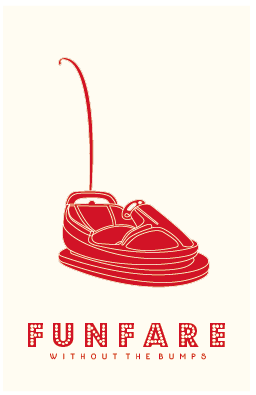
and I wanted something that would stand out from this competition. As my idea developed to the funfair theme I looked more specifically into those kind of aesthetics that I feel really enhanced the design and added authenticity.

A strength of this brief was the clarity of my concept as I was chosen to go to the Elmwood studio to pitch it to them. I was very proud of this achievement as it was something I hadn’t expected. I found during this pritch my presentation skills were strong and I could talk about my ideas confidently. I feel this was due to the level of practice we have had during the time on the course.


I think a weakness of this project was the overall quality of this design. Even though the concept was strong I feel the visuals could have been improved to meet the same standard. The end results were also something that didn’t fit with my current aesthetic style so would look out of place in a portfolio.

Thursday, 23 January 2014

Elmwood - Studio Visit and Pitch.

As part of this brief a selection of students got chosen to take their 'brand the boring' pitch ideas and present them at the Elmwood studio in front of a couple of their designers. My idea was lucky enough to get selected along with six others. Initially I was very shocked as I hadn't expected it due to the high level of competition from others on the course, however I was also very excited.

It was arranged that we would meet as a group at the studio where we had a quick tour around the building. I was very surprised at how large it was inside as from the front it looked like quite a small space. I loved the large open spaces and how there was a variety of different spaces for people to work. On the walls and placed around were examples of previous work that was really interesting to see.

After looking around we moved to the conference room and took it in turns to present our boards and idea. I found surprisingly when it came to my turn that I wasn't as nervous as expected and I felt confident in what I was speaking about. I feel like this is because if the relaxed atmosphere and also due to the experience I have gained presenting from my time on the course. I felt that I spoke about my idea clearly and enthusiastically.

After each of us had finished there was a short discussion about our work, positives and improvements that could have been made. The feedback I received was that my overall theme was very strong and the unique quality would be very appropriate and exciting for the audience. It was also said that the supporting elements were very relevant and fit the fairground idea well. Some improvements that were suggested mostly revolved around the choice of type, as it was felt that it could have been more carefully considered.

Overall this was a hugely beneficial and exciting experience for me. Not only to be invited into an award winning international studio and to be able to see and experience where they work, but also to present my work to working professionals and get valid, helpful feedback. I found that this experience has given me confidence in that my work had be chosen for this stage and also that I can present confidently in front of new people.

Sunday, 15 December 2013

Elmwood - Final Designs.

Here are some examples of my final designs of main and supporting material. Starting with the initial business cards that sparked the design aesthetic for the rest of the products.


As a way of attracting continued custom this loyalty ticket was created as it entices the customer to return to the brand as a way of saving money in the future. As a way of continuing the theme it has also been designed in the style of a vintage ticket, with language the audience would associate with this. For examples 'admits one' and 'earn a free ride'. The visual style has been continued to create consistency for the brand identity.


As a supporting item I have designed these in car air fresheners with scents that the audience would associate with the fairground. Therefore increasing the sense of an overall experience in the taxi journey. The smells could also be linked with positive memories the customer may have, therefore taking them back to that time.


Finally a very memorable vehicle design has been created. The bright red would be iconic for the brand and would stand out a great deal on the streets making it easy to spot and flag down. The branding has been applied in the same place that I found is common in order to create some familiarity and consistency.

Saturday, 14 December 2013

Elmwood - Design Development.

After help from the interim crit and further research I have developed the aesthetic of my idea. I have decided to continue solely with the bumper car illustration as it links most strongly with the area of business and also is consistent with the new saying 'without the bumps'. I also felt that one image would work most successfully as it creates a stronger brand identity.

I initially looked at altering the type from the previous designs. I picked this particular type as it is clear to read whilst giving a modern approach to funfair typography. I also experimented with colour looking at the bright theme as well as the red on off white, which was ultimately chosen as the most successful.


I then thought that the composition could do with an outline to enhance it. I felt that the thinner line gave a slick appearance that I really liked, however I thought back to the interim crit where I was advised to go all out with the theme and really push it. This is why I decided to continue the aesthetic of the lights.


Next I moved onto the reverse side where I decided to inver the colours. I continued with the type style and layout of the initial logo for the copy. Initially I had the company number within the light box however I felt this was unsuccessful so I continued with the light border instead.

Wednesday, 11 December 2013

Elmwood - Funfair Type Research.

From the interim crit it was suggested that I should push the funfair theme further so I have decided to research into funfair typography and the general aesthetic to see how I could incorporate into my own designs.

One style that was common was the decorative and exaggerated serif that takes the letter shape to a new level. The characters themselves are usually very bold to accommodate the additional decoration. As well as the outline a lot of these examples also have patterns incorporated into the inside as well. I find this very interesting aesthetically, however I feel when printed on a small scale like a business card it could become quite illegible.


Three dimensional effects have also proved to be quite common with the letter being given the hint of a structure as well as strong drop shadows. I feel that this technique would be easier to use as the shapes have been simplified yet the detail can still be added with a gold shadow effect.


Pastel and bright colours have been a a reoccurring theme and I like the strong contrast they have. I think this style is extremely effective within the environment it is meant for, although I believe that if it was applied to the taxi sector it could be a bit over the top and unnecessary.


Finally I love the aesthetic of fairground lights, especially when incorporated into typography. I think this would work within what I'm doing as the bold characters will be legible and the light effect could easily be incorporated, as demonstrated in the editorial piece with a typeface I have already experimented with. From these images I have also sensed a strong colour palette of reds and whites, I find this extremely effective as it hints to the fairground look whilst still being tasteful.


Saturday, 7 December 2013

Elmwood - Interim Crit.

Recently, Steph from Elmwood visited the studio to do an interim crit for this brief to discuss peoples initial ideas and progress. Here was my feedback:


  • Funfare idea is strong and quirky, definitely something that people will remember
  • The idea of bumper cars could be associated with dangerous driving
  • Pair with  a slogan that cancels this out
  • Funfare - without the bumps?
  • Theme of the funfair could be pushed a lot further
  • Look at more products associated with the fair
  • Use of language
  • Design aspects like typography and colour


Friday, 6 December 2013

Elmwood - Initial Designs.

I have decided to develop the idea of 'Funfare' as I like the play on words and I feel it can lead to some exciting and imaginative imagery. I began by looking at typography with associations with the fair, garish and decorative styles that would grab the audiences attention.


However I then decided to opt for more simple type and push the theme with imagery instead. I found  a selection of items that I felt summed up the funfair experience, these are bumper cars, big wheels and the helter skelter. I picked this colour scheme as I felt it would stand out from the competition and it also links with the common association of the famous yellow cabs. I like the simple linear style of the imagery as it gives a contemporary and clean appearance.


Thursday, 5 December 2013

Elmwood - Word Research.

In order to get some more creative ideas I have decided to look at the meaning of the word taxi itself to see if there is any interesting connections I can take advantage of.


Initial Ideas


  • Taxi - Aeroplane - ready to take off
  • Taxi - pronunciation - Tak - Si?
  • Funfare - low priced taxis - fares that make you smile
  • Going the extra mile
  • Going from a to b
  • HOLLA for a cab

Wednesday, 4 December 2013

Elmwood - Primary Research.

I have decided to look into what people want from a taxi service and what would attract them to a certain company. The audience I am targeting is students as I feel they are a common user within this sector in the centre of Leeds. A survey was handed out around the studio and also the rest of the college and I gathered 50 responses. I gathered a list of qualities that I believed people would think would be necessary from a taxi service and asked them which was the most important to them. Here are the results:


  • Friendly service: 10%
  • Low fares: 32%
  • Arrives on time: 21%
  • Clean car: 3%
  • Get to destination quickly: 27%
  • Easy to arrange: 7% 

After gathering the results it became clear that the biggest factor for students when booking a taxi is price.

Elmwood - Initial Research.

To initially get a feel for this industry I started looking at the current branding for taxi companies in the Leeds area as this would potentially be my competition. I found that across the board they were all very similar, with none standing out against the others. The colours that were commonly used were red and blue, although I'm unsure why this is. The branding has also been applied to the cars in the same way, however I don't necessarily believe this is a bad thing as it creates consistency for the audience in recognising cabs from passing cars. The typefaces are also always sans serif, with caps and bold styles being favoured.

I feel that for my new brand I would like to design something that breaks a lot of these conventions and come out with an outcome that is unique and will rand out against the competition, therefore making it memorable for potential customers.