To get a better understanding of what Lauren wanted we went through current designs and talked about possible ideas and opportunities.
The pastel colours in these designs really appealed to us and I like how they merge together to create different tones. The crisp whet against the colour is also very effective.

These coloured sides are so eye-catching and I love the contrast it creates. Lauren also really liked this so I think I will look into possible ways to recreate this idea. I like how the layouts for front and back are quite simple as it makes the colour the focal point.

This design gives an example of creating slight variation but still having a consistent theme across the range. I will have to look more closely at Lauren's work to see if this is a viable option. Again the sharp contrast between the black and white looks really sophisticated and contemporary.

Here is another example of applying colour to the sides of the cards. This time however the colour isn't a constant block as the colour is created by a separate piece stuck inside the front and back. This still looks great but we preferred the appearance of the constant colour.

The bold contrast of these colours is really exciting and it is enhanced by the slight effect of the embossing. I think a logo like this would look really successful.


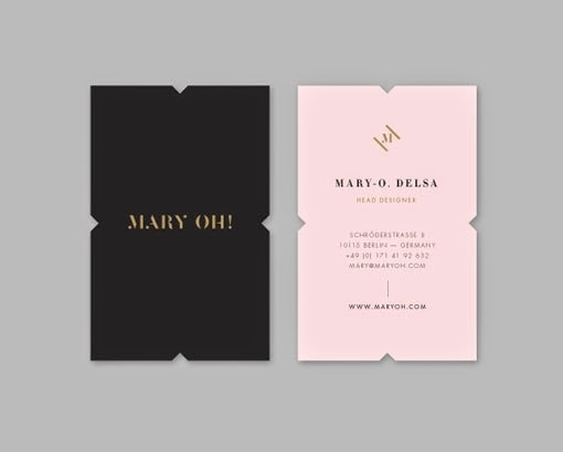
This design really stood out to both of us as we loved the colour palette and attention detail. The cut edges really appealed to us but we struggled to think a valid way to cut them successfully and on a large scale. The portrait layout is also something to consider.
This is another example of an alternative scale and composition. I think this square shape would really be memorable if it was handed to someone. This layout also alters how a logo would be created and displayed.

I really like the simplistic style of this business card, I think it demonstrates how a design doesn't have to have a lot going on to be successful and interesting.

The gold additions to this design give a very luxurious appearance. The gold on the sides is particularly interesting as I hand't considered using metallic sprays before. The foiling process also gives a lovely shine.

Within this example I love the blind emboss, how the logo is visible without ink and just by the light and shadow created by the imprint. The textural aspect is also very interesting and engaging.

I chose this image due to the choice of stock that was used to create them. They have a handmade quality that has an interesting texture that will be great for the audience to interact with. However I don't know if this will be suitable for Lauren's style of work.

This is a more subtle version of side printing with a thin line travelling through the pack. I feel lie this would be something very interesting for the audience to engage with.

With these examples I like how the photographic images link so well with the coloured background. I think in this case it is better than white as it has such a strong aesthetic.

No comments:
Post a Comment