To help with the design of my products I have conducted some research into current items on the market and what is successful within a kids target market.
The first item I came across was this egg cup which is obviously very strongly related to the theme I'm working with. I like how something like this gives a playful aspect to eating eggs, therefore making it more engaging. This ultimately would encourage the child to enjoy that particular food.
This is a very simplistic style of children's table wear but I love the incorporation of bright colours and how they look together as a set. The material is easy to clean and also very hard to break.
These next two examples demonstrate how print and character illustrations can be applied to the shape of the products. It is interesting to see the different ways the compositions can be arranged. I like the bright colours and how the contrast with the crisp white.
I find these animal themed plates really fun and I can see how they would apply to children. I think it is clever how the different sections have been incorporated as part of the design and how the shape of the surface has been adapted to create ears.
I like this set as it shows how a design theme can be applied to a large range of objects.
This example is very interesting because of its interactive qualities. Not only would it be fun for the child to interact with but it also has the educational element that can be incorporated with meal times.
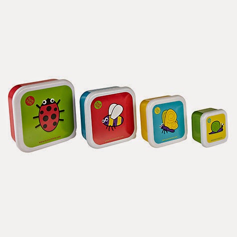
This is another set with educational qualities of helping young children to learn colours and animals. I like the simple colour palette and how the whole collection works together.
These dinner sets are personalised that I feel could help the child to make a connection with it. I feel this is a great idea however I don't believe it would acceptable for my collection.
This is a different take on kids table wear as it is throw away paper items, more suited for parties etc. Even though I like the design I feel it isn't the route I would go down.
Lunch boxes isn't something I had previously considered but after seeing these it reminded me how relevant they are.
These are examples with lots of different elements, very similar to my own design so it is great to see how these collections have been approached. I like how similar aspects have been used and repeated but there is still a great deal of variety amongst the products.