Sunday, 30 March 2014
Saturday, 29 March 2014
Yearbook - Work Photography Session.
Some of the students needs their work photographed because it was either 3d or used processes that wouldn't be visible with a scan. We wanted to have them photographs with our own input so we could ensure they all had a consistent look. We initially organised for the photographer we used previously to help us as we have limited knowledge of photography in a studio set up, however unfortunately they pulled out last minute and it was too late to find an alternative. This meant we had to do it ourselves, which wasn't ideal but there was no other option.
We arranged for a time slot that all the students would come and drop off their work, we thought this would be more effective than them coming at different times of the day. I was in charge of collecting the work and labelling it so we knew who was who. I used a spare table in the studio to lay it all out. It was then transferred to the photography area.
It took us a while to set up the lights and camera but once that was sorted everything flowed quite smoothly. When taking the images the first shot always had their name on it so we could keep track. Once we had finished we transported all the work back to their studio.
Even though this experience was initially quite stressful we were really pleased with the end results and I think it looks professional.
Thursday, 27 March 2014
Yearbook - Communication.
Communication and organisation has been a huge part of this brief and a lot more than initially expected. We have had to ensure that we stayed in contact with the textiles team in order to meet important deadlines and milestones.
One major problem that we faced was that our original photographer was unable to attend the second session that we had planned to photograph the students work and due to the late notice we were unable to find anyone else to replace her. This then meant that we had to take them ourselves. It wasn't easy with our limited experience in photography but we got the job done. I feel this gave me an insight into problems I could face in the real world of design.
Examples from Emily's inbox:


Wednesday, 26 March 2014


Thursday, 20 March 2014
Personal Branding - London Promotional Packs.
In preparation for my trip to London I have created a small promotional pack to hand out to the studios we visit. I have developed my old personal branding into something slightly updated. The main change is the colour scheme from the bright pink and white to a trio of grey, mint green and purple. I feel these tones are a lot more relevant to my current practice and I like how they work together. Because I have this variation of colour it has allowed me to mix up how the packs are put together and I like the effect this has. I have also applied my logo using a vinyl sticker, I like the subtle appearance of this technique and how it is more interactive for the audience. To go along with my business cards I also produced an introduction card that spoke a little about me and my interests within design. As well as this I also have postcards of selected examples of my work, as even though my behance account is stated I thought it would give an initial first impression.


Yearbook - Writing a Brief.
As part of this publication our initial plan was to have a wrap around cover that would feature an exciting print design. Initially we were considering designing this ourselves but after some consideration these seemed stupid as it would be much more effective to use a design by someone who specialises in this, i.e a student from the course. We discussed this with Duncan and he thought it could be a successful idea. This is the brief we produced.
Wednesday, 19 March 2014
Cosmetics - Supporting Items Primary Resaerch.
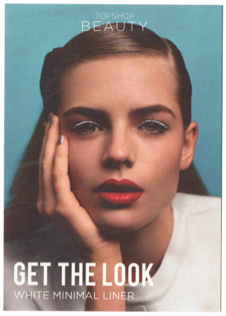
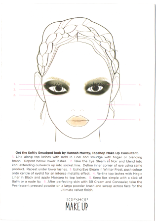
Recently whilst shopping in Topshop I came across these small cards that were placed around the store that I felt was great promotion for the makeup collection. The front side of the handouts show an aspirational image of a good looking young women that the target audience would aim to be like. The text adds to the hook by saying 'Get the look', insinuating that the consumer can infact achieve this image. Once turned over there is a cool illustration and a step by step guide on how to recreate the front image that obviously features only products from the store. I feel this is clever as it guides the shopper to buying a whole range of items rather than just one or two. People that may not be as comfortable with make up would also feel like these were the items they would need to buy. This is something I would definitely consider for my own promotional material.


Saturday, 15 March 2014
Cosmetics Brand - Cosmetics Primary Research.
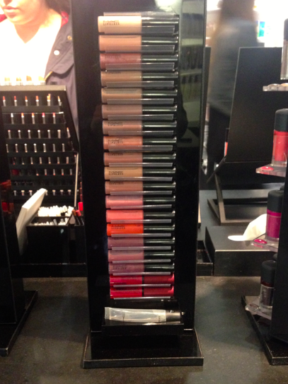
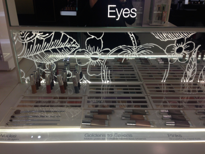
Recently I visited some shop to gather imagery and information from high end make up brands. I wanted to look at their packaging, branding and point of sale and how they all interacted together to create a consistent look.
The YSL stand was very striking due to the bold black and gold colour palette. The metallic aspects really shined out when walking past and I think this could really work in catching the audiences attention. The promotional imagery used featured two famous supermodels this kind of advertising would really attract the aspirational target audience.


Next was mac, initially I was drawn to an example of their point of sale as the bright colours were a strong contrast to the majority of black stands that surrounded it. I feel that this is a clever tactic as it draws the customers eye to new products that they may have never previously seen. With the items being displayed in this 'stage like' way it makes them seem more important and therefore more desirable. The other stands were identical in style, they are very simple which lets the products speak for themselves, the solid black base also helps the products colours to pop.


This was a small compact stand for Lancome, showcasing just a selection of products. The three levels are different colours that I think gives each a different look and personality. Because there are limited items it also makes it much clearer to view for the audience. The use of a photographic image could draw the consumer in and lead them to believe that by using the products they could in turn look like the model in the image.

To me the Estee Lauder stand is more suitable for an older target audience as I feel the branding and packaging style is quite traditional, and has less of a contemporary or edgy appearance. The product packaging is also varied in colour that makes the overall composition quite busy.


The Laura Mercier counter was quite image heavy that made the stand interesting to view. The photographs on the back wall were exciting and engaging to the products.

I love the clean white appearance of the Shu Uemera products. I feel that the seem very crisp and clean and have a modern appearance. However I do feel that in block it can appear quite clinical and could be broken up with a few alternative tones or maybe introduce some print or pattern. I feel the white really helps the colours of the items to stand out as they appear brighter and more exciting.


I really like the clean and concise appearance of these Chanel products. The area isn't overloaded which makes it easy to view. Because of the small amount of items it also gives the impression of a limited edition, making them seem more desirable.


Subscribe to:
Posts (Atom)