Recently I visited some shop to gather imagery and information from high end make up brands. I wanted to look at their packaging, branding and point of sale and how they all interacted together to create a consistent look.
The YSL stand was very striking due to the bold black and gold colour palette. The metallic aspects really shined out when walking past and I think this could really work in catching the audiences attention. The promotional imagery used featured two famous supermodels this kind of advertising would really attract the aspirational target audience.


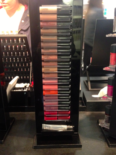
Next was mac, initially I was drawn to an example of their point of sale as the bright colours were a strong contrast to the majority of black stands that surrounded it. I feel that this is a clever tactic as it draws the customers eye to new products that they may have never previously seen. With the items being displayed in this 'stage like' way it makes them seem more important and therefore more desirable. The other stands were identical in style, they are very simple which lets the products speak for themselves, the solid black base also helps the products colours to pop.


This was a small compact stand for Lancome, showcasing just a selection of products. The three levels are different colours that I think gives each a different look and personality. Because there are limited items it also makes it much clearer to view for the audience. The use of a photographic image could draw the consumer in and lead them to believe that by using the products they could in turn look like the model in the image.

To me the Estee Lauder stand is more suitable for an older target audience as I feel the branding and packaging style is quite traditional, and has less of a contemporary or edgy appearance. The product packaging is also varied in colour that makes the overall composition quite busy.


The Laura Mercier counter was quite image heavy that made the stand interesting to view. The photographs on the back wall were exciting and engaging to the products.

I love the clean white appearance of the Shu Uemera products. I feel that the seem very crisp and clean and have a modern appearance. However I do feel that in block it can appear quite clinical and could be broken up with a few alternative tones or maybe introduce some print or pattern. I feel the white really helps the colours of the items to stand out as they appear brighter and more exciting.


I really like the clean and concise appearance of these Chanel products. The area isn't overloaded which makes it easy to view. Because of the small amount of items it also gives the impression of a limited edition, making them seem more desirable.


No comments:
Post a Comment