Wednesday 30 October 2013

Galina London - Label Experiments.

I have started experimenting with some possible label designs to apply to the brand. I initially looked at possible layouts incorporating the text and image aspects and found that they don't necessarily have to be used together to be recognisable. Although I found that when they weren't both incorporated the composition looked slightly bare.


I then continued with my preferred layout and also started experimenting with the pink colour used for the logo submission. An idea that really appealed to me from my research was the use of multiple layers. I have taken this and developed it to take advantage of the different stages. I thought about using laser cut on the image aspect so that the colour on the base shows through highlighting the shape. I then moved further to also cut the text but I feel that on a practical level this will not work as the letters are very delicate and some could be deconstructed, for example the 'a's' and 'o's' as the centre pieces would be removed.


From this I then developed the form so that the base piece of card would be longer and appear below the base of the other. This allows the text to be placed there and still be visible. I think this layout is most successful and takes advantage of the different layers the best. I finally experimented with some new colours, although I feel they look tacky and not suitable for the brand.


Galina London - Branded Ephemera Research.

I have began researching into how a shops brand can be applied to a variety of products within the environment. I have selected a range that are not necessarily in the sector of Galina London as I think this will give me a broader range of ideas and more inspiration.

Five Kids


This store is obviously suited for a parent and child market so the style of design isn't something I'm necessarily looking at but more the products they have placed this look on. There is a definite consistency across the range and I like how the characters and print work simultaneously. I really like how this print has been applied to the till roll as it gives a really playful touch, suitable for the audience.


Heraldi


This is a more masculine brand and I feel the branding really supports that. The shop front looks really effective and ties in very well with the selection of supporting ephemera. I really like the contact card where the customer can fill in their details. I also like how there are two sizes of bags that are identified by the use of inverted colour, this is a clever way to add variation.


Maeven


There is a very strong sense of brand across these items, which is created by the use of colour and shape. The logo itself is very simple but because of these other aspects it gains a real feel of personality. I think how all the items fit together in a creative pack is really interesting as it brings all the design aspects together. I also like how the polka dot's have been applied to the box packaging to add a finishing touch.


Anne Mette Fisker Langkjer


This design is very simple but there are some subtle touches that show it has been thought about very carefully. For example on the box some parts of the logo have been cut through so that the tissue inside the box shows through and adds a pop of colour. The labels are also a selection of cards in different coloured stocks which I think looks really effective.


Air Clothing


I think the branding of this store has been applied cleverly to this variety of products. I like how there is a base design for the carrier bag but it has been altered to create a variety of interpretations. This could be something that the customer would want to collect, therefore purchasing more products. Promotional material has also been designed which is something I hadn't necessarily considered.
M&S Picnic - Picnic Pack Research.

I have now started looking into other picnic packs and packaging with a similar aesthetics on the market to broaden my research.

Cornelia and CO


 Oriol Gil

I really love the design of these products and the strength of them as a set. The colour palette it very strong and the use of brown paper and card really lends itself to the aesthetic look. Print has been incorporated very subtly but is a great asset to the overall look. Varied type faces has been used but because the rest of the design is so simple it works well and adds some interesting variation. There has been great attention to detail which gives a very professional finish.


Benedict


Orit C

This design has an interesting take on incorporating the picnic blanket itself into the packaging, although I feel this is something I won't do as I think it makes it look slightly messy. The branding itself is strong and I like how pattern has been used as a theme for each. The structure of the box is also very clever, this is an aspect we will have to really consider in order to have a successful end result.


Picnic in a Pocket


Sapir Akerman

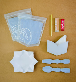
This is a very quirky project that really caught my eye and although I feel this is a concept I wouldn't take on myself I still appreciate it's quirkiness and shows how creative you can be. The idea is very strong and I like how they have focussed on making something that is easy for the audience to carry and isn't a heavy burden. How all the aspects fold down also helps them to fit in the pocket pouch.

Tuesday 29 October 2013

Brabantia - Extending the Range.

After creating the products using just my print I have decided to extend it further to create a larger range. To do this I have made replicas of the items but used a base colour from the design. I think these work great now as a larger set. The utensils also work successfully as a plain colour as I think if the pattern had been applied it would have been to busy and unrecognisable.


Monday 28 October 2013

Brabantia - Applying to Products.

To extend this brief further I have decided to take my final pattern and apply it to a selection of other Brabantia products. I think this will help to show the versatility of the design and also give a bigger sense of context. I really enjoyed this process as it was good to see the print come to life and also to see the beginning of a set of products. I experimented with a variety of scales in order to get the best composition, in most cases I found that the larger options worked the best. Once I had chosen the one I thought worked the best I moved to Photoshop and added some gradients to give a three dimensional effect, I think this really helps.


Brabantia Touch Bin


Brabantia Window Canister


Brabantia Ironing Board


Brabantia Bread Bin