Summer Days Picnic


Sam Aylard
This to me summarises the traditional idea of a picnic and I think the theme is a bit week as it does't really push the boundaries of what a picnic could be. The design style also follows this idea and the use of pastel tones and checks epitomises this. I think the overall outcomes look good but I just think the concept could have been more adventurous.
Keep Calm Picnic


Karly Sykes
I think this concept has more going for it and I think some aspects are successful, for example 'keep calm, we've packed it for you.' Although even though the text follows the iconic design of 'keep calm and carry on' I think the rest of the design hasn't worked as well and there could have been more links. The use of the brown card is a good idea but I think the bright green looks quite garish against it.
Mad Hatters Tea Party Picnic


Claudia Griffin
I think the idea behind this pack is really good and all the aspects have been very clearly thought about and the theme is very strong. The design style also works with the concept but I think some of the products could have been constructed better as it does't give a very professional look.
Traditional Picnic


Jennifer Swales
This is another pack that has focussed on the traditional picnic theme, although I think that this is more successful. I like how a selection of prints have been used and the colours within them are very complimentary. The choice of type is also more contemporary which makes it more appealing to me. It is also packaged in an interesting way that showcases the design well.
Mountain Picnic


Florie Parenthoux
This pack has been packaged in a very different way to everything else, using the mat as way to carry the products. This is a clever idea and a unique selling point to the customers. The design style is also very geometric which is quite unusual for this sector making the product stand out further.
Chinese Picnic

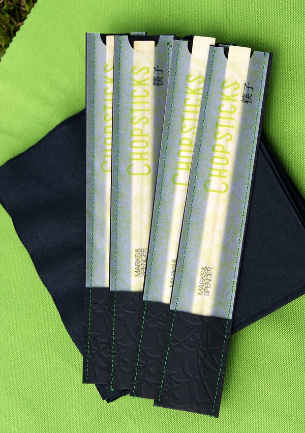


Susie Smith
I really like this theme idea and I think it has been finished to a very high standard. The contents have been really thought about and are very unique from a traditional picnic. I like the use of black and green and also the floral print that has been used throughout. The embossed and laser cut elements give a luxury look and demonstrates how these processes can be used within these type of products.
60's Picnic


Kudzai Dyirakumunda
I think by designing for an era like this is a really good theme as it gives a very strong brand identity that the customer can easily relate too. The black and white imagery works very well in putting across the theme and also looks great aesthetically with the bold colour and type.
Farm Picnic


Lucy Dawson
This pack demonstrates how to target a children's market successfully. I like the idea of creating characters that fit with the environment and then taking them and applying them creatively across the products. I think having a selection of characters is good as it is something that children would like to pick from and choose their favourite.
Seaside Picnic


Claire Coulthard
I love the bold vibrant colours in this design and they work well together to create the fun atmosphere associated with the seaside. The style of type used is also a main component in putting across this theme. It isn't visible in these pictures but the small pot have also been used to create sandcastles, I think this is really clever and gives another use to the packaging.
Moustache Picnic


Lam Kam Wah
This is a really quirky idea and something that is bound to attract peoples attention. The food packaging has been kept really simple so that the attention is placed on the moustaches themselves. By having something like this it gets all of the people attending the picnic involved and enhances the group experience which would make it more memorable.
You are what you Eat Picnic


You are what you Eat Picnic


I feel that this is a really well put together project and the aesthetic style is something that appeals to me a lot. The packaging is very simple and the different aspects work seamlessly together. The box itself is a very clinical shape, which works interestingly well with some of the rustic elements within the set. I like how these two styles enhance each other.
London Olympics Picnic


This is a very clever concept, as I feel that the olympics may have been something that had been slightly overdone. But this take is very interesting and the new idea keeps it fresh. I really like how the fruit has been used to imitate the rings and bring some context to the picnic. Other elements also link with theme like the occurrence of the 1, 2, 3 idea and also the bronze, silver and gold. The box itself is also interactive which adds another element for the customer.
No comments:
Post a Comment