


Joseph Veazey
I find this look book pack really inspiring and I love how all the elements work together. I think having all the pieces presented like this to the client would be a great idea as it gives a good impression of the brand. Because of how everything is packaged it gives the impression of a gift and something exciting for the audience to open and view. Everything has been crafted to an excellent standard which gives a very professional look.
Rocio Aguilera


I really like the simple approach of this example as the clean look is very sophisticated. I love the use of block colour as it carries on the professional look and also the repetition of the same tone is good as it makes a link to the brand that will be recognisable to the audience. On the image and text layout I like how both elements interact with each other to give a very interesting composition.
Jean.Machine


Two Times Elliot
This publication has a very hand crafted feel, because of the one colour print and the quality of the stock used. Even though I appreciate this look and how it would be suitable in some cases I don't think it would be right for what I will be creating and the audience that it will be aimed at. Although this does show how something can be made cheaply but still have a high-end look.
KKTZ


Two Times Elliot
The style of this look book is very interesting and is another example of one being printed on a cheap stock. I really like the use of symbols and quirky compositions as it gives this publication a really quirky look. Because the design creates such an impact it has also given the brand a very strong identity that will be easily recognised.
Victoria & Albert


Carlie Templeman
This publication takes a much more soft approach and has a strong feminine vibe. This is created by the style of photography, soft muted colours and the use of hand written type. I like how in some cases the text overlaps the images as it gives the idea of a sketch book and the writing is someones personsonal thoughts.
PdH


Raul Iglesias
The cover here has been embossed and uses no ink, because of this from a distance the text could be hard to read which would lead the audience to pick it up and take a closer look, igniting their interest. The text in the content has been kept to a minimum and is often surrounded by a lot of white space making it the centre of focus. Overall the layouts have been kept very simple and therefore the communication is clear.
Massimo Dutti


This is another look book that comes in the pack and I love the bright yellow of this example. The contents of the publication is also very interesting in itself especially how certain aspects fold out. Tracing paper has been used frequently and the effect is brilliant as it adds another dimension to how people interact with the product. It also makes it memorable and would stand out to the audience.
All That Glitters is Gold


The foiled cover of this publication was a great idea as it links strongly with the name of the book, it also gives a high end and professional look. I love the rich colours in the photography and how they stand out among the more neutral tones, highlighting certain products.
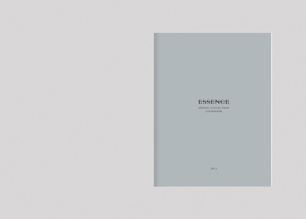
Essence


Shez Online
This publication has used varied layouts to add interest the the pages. I feel the different compositions were especially needed as the photographs are so similar it needs something to add a contrast.
Castaner Spring


No comments:
Post a Comment