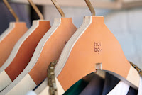
This logo design has a very simplistic approach that incorporates type and image, where both aspects can be used individually or together and the brand still remains constant and recognisable. I think having two separate icons is good as it creates more versatility. The colour palette is very neutral which adds to the simplistic look and helps enforce the brand identity.
Hoi Bo
This logo has a very strong appearance, created by the use of a bold sans serif typeface. I also think this is helped by the placement of type that creates a square shape as it keeps the letters condensed into a block. The diagonal line also adds to this effect. I like how the logo has been placed over images using opacity and it still remains clear because of the contrasting colour and strong lines an stroke width.
TenOverSix
I love the use of a gradient on this business card and how the white stock is left to reveal the brand name. I think this has worked successfully because of the bold typeface. I also like the illustrative aspect of depicting the location of the stores, the simplistic line drawings work well especially in a block colour. The contrast of the script type also creates a hierarchy, drawing your eye to the brand name first.
Thread
I like the clever use of type in this identity and how the style of the font really depicts the feel of the brand. On the surface it could appear as a standard serif typeface but with a closer look the thread-like appearance becomes apparent. How the logo has been incorporated with photography also works well as it clearly shows the brand without being overly distracting from the products.
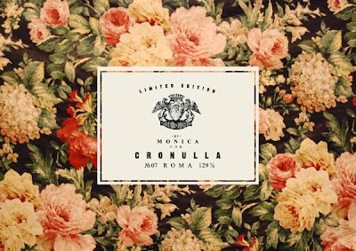
Monica
I feel that the incorporation of pattern in this identity has been very successful as it gives a deeper look into the style of the brand. How it has been done also allows for different designs to be used for maybe when a new season is being launched etc. The logo has a very traditional feel which is created by the coat of arms style illustration.
Cotton Love
I think this logo is really interesting and I love the play on the double 'T' as it gives a unique touch and something memorable for the consumer. I like how this created shape has been used on it's own to create a pattern, by doing this the brand can be recognised on this symbol alone without the customer seeing the company name. The simplistic look allows the logo to be applied in a wide range of scenarios and remain consistent.
Tilting Clothing
This a logo design that has clearly been thought through very thoroughly and the brand name has been a big inspiration in the development of the look. the italic typeface has been highlighted by the use of the red, diagonal line. This line has also been used individually and had still remained recognisable because of its bold appearance on the main logo.
Rebekah Hill
This is a very simple design, given a quirky touch by the unusual symbol, because this shape stands out it can also be used individually to carry the whole brand. The pastel yellow colour had also been used consistently across the range.
Vanitas
I like how the bold form of this type allows it to be used in multiple ways. Either on its own, on top of an image or by using the image as a fill. My favourite is the latter as I this the bold appearance is really effective and it allows the texture of the image to show through giving a unique and different appearance. The two horizontal lines act as a frame around the type.
DEKA
The subtle removal of some of the lines on these letters is really interesting, I especially like how it looks over an image as it look like the type is merging into the photograph this effect is helped by using a lowered opacity.
LEJTENANT
This branding is masculine and leading away from what I would like to create myself but it is an example of a more image based logo. I like the use of line to create the form and this a smaller stroke width to add shading and depth. It can also be used with the type in a variety of ways to give a more interesting, varied look.
Akrylic
The type aspect of this branding is very basic but it is the overall concept that brings it to life, it has obviously been thought through in great detail. From the matching colour paint spot on the labels, the paint tube product display to the catalogue that has the look of a palette. Having a concept like this makes the brand identity very strong and memorable to the consumer.
Young&United
I like how this brand has a full and condensed version of their logo. With the type I also like the contrast between the letters and the & as I think it is very effective.


No comments:
Post a Comment