Aspects
that I have improved during this are my skills in layout design as the
composition had to be consistent not only through one editorial but also across
the whole range. This was very important to me, as I wanted each publication to
flow into the next. I also felt I learned more about how to work with a real
client and how to inform them on the changes being made. This was quite a quick
turn around brief but there was still some development that took place during
the process. After designing the first draft a mock up was printed out that
Lauren could look through and note down any changes that were needed to be
made. The things that were changed most drastically was the cover style and
also image orders.
I
gathered together a collection of research material for when I started
constructing the books. I found it was really helpful to have something to
refer to when the designing was taking place. Some main aspects I took from
them were interesting composition ideas for the images. I particularly liked
when certain photographs were positioned across a double page spread or the use
of margins.
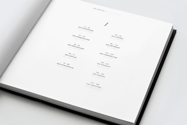
A
strength from this brief is the quality of the professional print. It was
really exciting receiving these as it is great seeing something come together.
I really like the simplicity of the design and how everything is so consistent
across all three editorials. Even down to the cover design where the images
chosen are of a similar front on, portrait style. I think the use of white in
the compositions really helps to frame the images.