After having final go ahead for our wrap around cover me and Beth started work on designing the revesre side that could be used as a poster. We wanted it to feature all of the names of students who contributed to the book so that it could be something personal and memorable they could keep and put up on a wall.
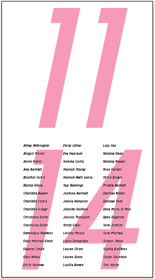
Because the names were the main part of the design we wanted to focus on this was the initial aspect we added to the composition. To fit them all in successfully we experimented with different column styles and point sizes. We also incorporated the year number to mirror the printed cover and add some context to the list of names. The course title was also incorporated and continued the experimentation of spacing.


As the composition was quite dull we injected some colours that we swatched from our chosen pattern. Opacity was experimented with to try out different tones and also to determine what level was the most readable. Another big difference was the increased size of the numbers, I feel this looks a lot more dynamic and I like the layered effect.


After choosing the pink as the most successful colour we continued with further layout experiments. We found that the list definitely looked the most successful resting on the base of the composition as when it was moved to the top it appeared as it it was floating in no where.


After looking at the design on the wall I suggested that it was maybe too close to the edge and that the composition would be more successful with some additional white space. As soon as we did this it made a huge difference but we felt there was still improvements to be made. The first thing to change was to alter the course type minimally. However we felt that the design could still be pushed further to make it more visibly exciting. Beth suggested to incorporate the pattern and I think this has worked extremely well.


For some final reference we printed the designs out one more time, which cemented the decision to have the print option.

No comments:
Post a Comment