Showing posts with label Cosmetics. Show all posts

Saturday, 10 May 2014

Cosmetics Brand - Evaluation.

During this brief I improved my packaging skills, it is something I have worked with quite a lot this year so I wanted to take my outcomes up a level. I decided to make the boxes slightly interactive and more exciting to interact with. To do this I created a patterned sleeve that could be slid on and off of the main box. This sleeve also has a cut out which enables the bottom layer to show through and breaks up the patterned area with a block of colour. I feel that these elements would really help the brand to stand out. I also improved my mock up skills, due to not being able to construct the exact makeup pots and bottles that I would have liked. I am really happy with the results and feel they look realistic.

My research started with primary investigations, as I wanted to see what the competition would be and gain knowledge on what information I would have to include on the packaging. I also investigated more creative makeup packaging to give a more bespoke finish to my own collection. As well as the packaging aspect I also needed to gain inspiration for the pattern design, I gathered my own photography of flowers for some primary research as well as current floral print designs, I feel like this helped when composing my pattern.

A strength I feel for this is the consistency of the product and outer packaging. I really like the combination of the blue and crisp white and how the products have a slightly clinical appearance, I feel this is needed to due the decorativeness of the outside. I also think a shelf of all white products would create a lot of impact.


I think a weakness is that I could have produced more promotional material and even things like shop displays and signage. This would haver really extended the collection and brought it full circle.

Tuesday, 6 May 2014

Cosmetics Brand - Combining Imagery.

To give a better idea of my collection I have combined my packaging photographs and digital mock ups to produce and example of how they would look together. When taking the photos I made sure I had exact front on shots as I knew this is what I would need to make the composition look realistic with all the different elements. Initially I was unsure if it would all work and come together, but I am glad I took the time as I am really happy with the results.


Monday, 14 April 2014

Cosmetics Brand - Applying Branding to Products.

I have now began to apply my branding to digital mockups of the products for the collection. I have chosen white as I feel it links well with the outer packaging and gives a crisp and fresh appearance.

I started with the foundation bottle and began by applying the logo and other relevant information in the previous style applied to the boxes. I also looked at how 'fleur' would appear placed on the white lid and I like the aesthetic appearance but not the overall appearance of the composition. In addition I experimented with the logo being placed vertically to mirror the packaging but again I felt this composition wasn't successful.


Originally I stayed with my initial option as I felt it was the easiest to read and the composition was the most successful. I then applied this to a range of colours to suggest the range. To develop this further I also took elements from the pattern design and applied it to the lids and I love the appearance of the white on white as well as it linking the packaging and product more effectively.


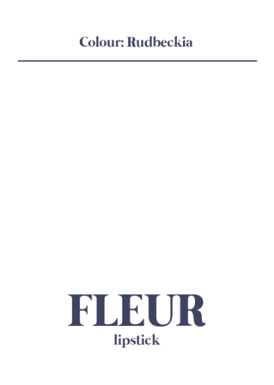
I then moved on to repeat this process with the lipstick case and continued with the white on white that I was really pleased with. A few compositions were experimented with but I felt the most successful was with the largest point size that spread across from the base to the lid. I felt that this was the most dynamic and interesting. I also experimented with applying the floral illustrations but due to limited space felt it wasn't as successful. I finally applied my chosen design to mockups that demonstrate how it would look with the lid removed and with a small variety of lipstick colours.


The bronzing powder had a very simplistic appearance that I liked and I continued with the style that I have been developing. I found that this composition had a lot of available space so when I incorporated the flower design it fit in well and really added to and complimented the overall look.


Next was eyeshadows that had a much smaller surface area, initially I just applied the main logo and I liked the appearance onto the clear surface and how the eyeshadow colour could still be seen through. To develop it further I then applied the additional design but I felt because of the limited space the flowers became cramped and didn't display to their full potential.


I then moved on to continue the process with the mascara designs and I found this quite easy to do as the composition was easy to work with. Similar to the lipstick design that I found successful I applied the type in a large typeface that took up the majority of the width, although because of the additional space the floral pattern fitted on with much more ease and adds great detail to the products lid.


The final product to be worked on was the nail varnish and due to its very similar to the foundation I repeated the design exactly to give a consistent look. Although I prefer this as I like how the bright colours compliment the design rather than the flesh tones.