After help from the interim crit and further research I have developed the aesthetic of my idea. I have decided to continue solely with the bumper car illustration as it links most strongly with the area of business and also is consistent with the new saying 'without the bumps'. I also felt that one image would work most successfully as it creates a stronger brand identity.
I initially looked at altering the type from the previous designs. I picked this particular type as it is clear to read whilst giving a modern approach to funfair typography. I also experimented with colour looking at the bright theme as well as the red on off white, which was ultimately chosen as the most successful.

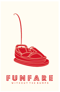
I then thought that the composition could do with an outline to enhance it. I felt that the thinner line gave a slick appearance that I really liked, however I thought back to the interim crit where I was advised to go all out with the theme and really push it. This is why I decided to continue the aesthetic of the lights.


Next I moved onto the reverse side where I decided to inver the colours. I continued with the type style and layout of the initial logo for the copy. Initially I had the company number within the light box however I felt this was unsuccessful so I continued with the light border instead.


No comments:
Post a Comment