
The muted pastel colours on this design really appeal to me aesthetically and I feel they coordinate well together. The shapes used are simple but I like how detail has been incorporated through subtle texture and linear patterns. The white space is good for the composition as it allows the audience to see the design clearly.


Michelle Masons prints are very engaging as there is a lot going on and the colours are very bright and bold. I think these demonstrate how busy, scenic designs can still work well within a home environment. I think the use of simple shapes to create the scenes is a good technique as it doesn't overpower the composition.


I really like the full effect of this print and how all the aspects interlock together with the help of smaller patterns and illustrative items. The colours are very vibrant and these types of tones really appeal to me. Studying designs like this brings me new ideas as to what I could include in my own pattern design, for examples sunglasses, umbrellas etc.
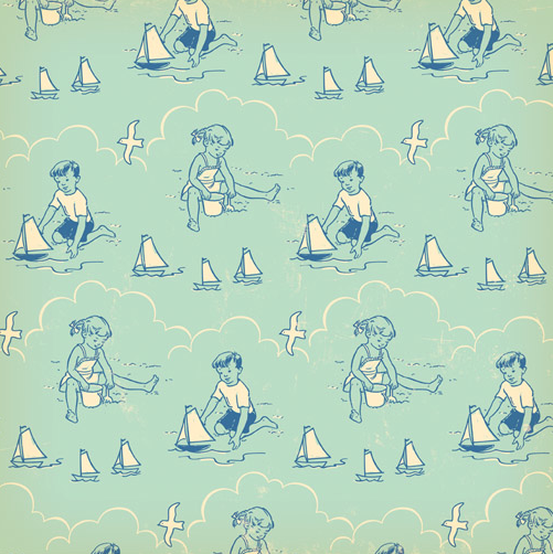

I like the vintage appearance of these prints which I think is supported by the illustration style and colour palette. I think a design like this would appeal to the Cath Kidston audience because of these qualities. By viewing these two examples it also gives me inspiration on how to create multiple colour ways, which is a factor of this brief.


These examples are more art pieces than workable prints but I still felt they were extremely relevant for my research. I find the scenes really interesting as there is a lot going on, but I feel when it comes to designing my own patterns individual illustrations would work a lot better for what I am trying to achieve.


These are cross stitches but I really like the style and feel they are relevant to my work. Because of how they have been created they have an extremely quirky style that really appeals to me. The shapes have also been simplified because of this which I think adds to the interesting look. They type also works really well and I feel links very strongly with the seaside theme.


This design is predominantly for packaging but the style of illustrations still really links with the pattern aspect. I find the colour scheme really interesting with it being predominately blue with hints of contrasting tones to add and highlight detail. There is also subtle texture which helps the piece to come alive and reflects the rugged subject matter.


This design focuses on a different part of the seaside that other designs haven't looked at, the pier. The structure has been made using simple shapes that have been highlighted with use of colour. I like how the rides have been incorporated into the composition but I wonder whether this will be relevant to the traditional theme I will be working with.
No comments:
Post a Comment