Friday, 8 November 2013

R.T Millinery - Business Card Research.

I have decided to look specifically at business cards not in the millinery sector in order to broaden my inspiration.

el estudio


el estudio

With this design I like the use of block colour and black as the contrast is strong and interesting. I also feel that the black border looks good and I like how it has changed the colour of the edge of the card. How type has been used going around the edge is also fun and makes the composition different and stand out.


Jonathan Shackleton


Jonathan Shackleton

The portrait style of this card is a slightly different take on the business card and is a lot less used than landscape. Having the logo bold on the front creates a lot of impact and I like how there is a variant on the other side. The spray paint effect on the sides of the cards is amazing and really helps them to be memorable.


Branch Soap


The use of pattern on these designs is something I really like, the box in the centre with the logo is a great way of making it stand out. The composition on the reverse side is very unusual and gives a quirk look. The pattern making its ways around the side ties it together and the circular stamp adds another level.


 Unique Position Pictures


She Was Only

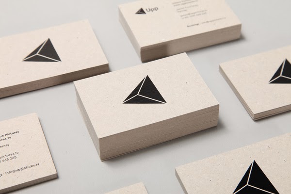
The logo on this business card and I like how the stock colour is used for the line to help define the shape. Another interesting aspect is how all the information has been aligned to the left with the logo alongside it, I like how this creates an unusual area of white space.


Kitska


Kitska

This design has a very feminine feel but the use of pink works well. I like how both sides of the card are reversed colours has it helps each of them to stand out and be recognised. The white border around the type is an interesting technique to draw the audiences eye. Another way of creating a frame has been to use type round the edges.


Christina Yan


A lot of very lovely print processes has been used on this design that I think makes it look very desirable. The embossing works well and looks great on the textured stock. The foiling also adds a great effect and highlights the texture even further.


Michelle Miller Interiors


I love the logo here and I think it's great how it has been left by itself on the front of the card. The gold effect on the logo and on the sides gives a very expensive and high end appeal and the use of simple type on the reverse supports this.


Engler Studio


Novelty Apparel


Origine Art


Glare


Monday, 4 November 2013

R.T Millinery - Business Card Design.

I have now started work on designing some business cards for this brief. I wanted them to be consistent with the look book so that they could work together within a set. To carry on with the duotone image theme I selected three new photographs and applied the effect. I feel that all three could be used to create variation but for these experiments I'm just going to focus on one.


I then moved on to add the branding and identification for the audience. As I still haven't heard back from Rosie on what logo she prefers I am experimenting with both. I started with a very bold look with having the type very large and overlaying the image I like the impact this gives but when the opacity was lowered I think the gives a more appealing aesthetic. I like this large lettering as I think it would really capture the audiences attention and makes the brand more memorable.


Afterwards I wanted to see whether the branding would be as strong and noticeable on a smaller scale. I think this still looks successful and the placement of the logo works well with the composition of the image. I also repeated lowering the opacity and I feel it gives a much better look than the stark, bright white.


Finally I introduced the thin white base line that is a common design aspect in the look book, as I felt that in the publication it was very successful. When I first applied this it didn't work well with the composition of the image and the logo was hard to read. This is why I decided to flip in the image so that the letters would fall on a darker area. Although it did become more visible I though this look wasn't as successful as the previous examples. Maybe it works better on the look book because it is on a larger scale.


I then worked on the back of the card and displaying the contact information. I started simply by using the bold, block colour used in the look book and just having the text, looking at various compositions. I do like the simplicity of this but I think more can be added to develop it further.


To add more to the composition I have again added the branded logo and placed them where they fit best within the composition. To add to this further I introduced the white line, I feel that it works much better within this layout. Although I am unsure whether now the space is too cramped with all the content.


To minimise the items within the space I have removed the logo. As long as it is on the front I don't feel that it is as necessary on the back. I really like the look of this as it regains the simplicity of the first experiments but adds a finishing touch.

Saturday, 2 November 2013

Galina London - Label Developments.

After my research into designer products I have completed some further developments on my label designs. The colour ways have been changed to emulate the trends in the high end brands. I found that I like the black and grey but feel that the pink and blue have a sickly feel and not appropriate for the Galina brand.

Galina London - Designer Brand Research.

I have decided to research into high end fashion brands and their related packaging. I feel that this will be very beneficial for my own designs in influencing a more sophisticated look.

Gucci


The use of a bronze stock alone gives a luxury feel, especially when it is paired with the gold tone type. The collection of products has a very consistent style that I feel has to be done to retain this look. The texture on the stock is also really interesting and is an attention to detail that really exaggerates the high end look.


Chanel


The black and white colour scheme of Chanel is very iconic and the contrast of these tones has a lot of impact. The use of the ribbon works well as the crisp white looks great against the dark black. The use of the flower also adds another decorative aspect.


Louis Vuitton


I don't think brown is a choice I'd make for Galina London but it links well with the Louis Vuitton brand. I love how spot varnish has been used as it allows the text to be in the same colour yet still be visible and in different lights gives off varied effects. The structure of the box in the top images also interests me, I like how it pulls out in a more unconventional way for a gift box.


Dior


The almost complete use of white used for Dior gives a very bright, crisp appearance. Also because the colour is very easily imperfected it gives a greater urge to the consumer to look after the product and packaging in order to keep it in the pristine condition. The use of ribbon has a different effect than with Chanel as it doesn't contrast with the boxes at all and has a more subtle look.


Lanvin


I love the powder blue of this packaging as I feel it stands out from the rest whilst still retaining a high end appearance. I think this pastel colour shade is something I may experiment with myself as I like the fun use of colour but in a more expensive way.


Jimmy Choo


This pastel pink is also a successful shade and I like how it has been incorporated with the metallic gold type. The pink hints at a feminine look without being overbearing and sickly.