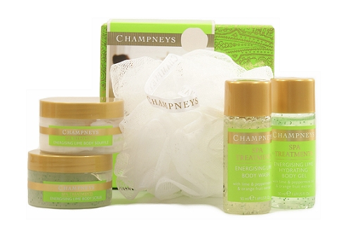
Here are some examples of current Champney's products that I have borrowed from a friend to show how they have been packaged. I feel from looking at these items that I can see why they aren't as popular with a younger target audience, as the whole aesthetic seems very dated and a style that older individuals would find a lot more to their taste. The gold gives an elegant personality, but not something that would stand out on a shelf. I also found that the use of colour for type hasn't been very well considered as the legibility is very unclear, it blends into the colour of the content.


The Champney's website has a really clean aesthetic that makes it easy to view and look at. The home page is interesting because of the collaged use of imagery and how some aspects rotate the content that is shown. I like how the type has been overlaid on these photographs as is gives a contemporary look.


The current site also gives information on packages and gift cards that I think will also be important for our web aspect.

No comments:
Post a Comment