Sanctuary
I really love the vibrant appearance of the sanctuary packaging, the bright orange and pink compliment the introduction of turquoise. The illustrations used are very large and take up a big amount of the composition. In contrast to the busy outer packaging and boxes the bottles etc remain quite simple, I think this is a good technique as the outside would attract the audience whilst the rest can remain clear and easy to read. It is interesting to see how the colour of the product itself can alter its appearance due to the transparent materials used. One aspect we really liked was the gift box with the acetate face so that the products can be packaged whilst still being able to be viewed.


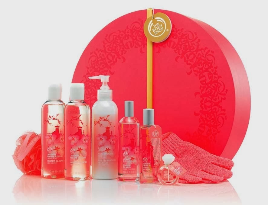
Body Shop
The Body Shop packaging seems to be more based around photographic aspects as it seems to be the centre of most of the designs, with common themes of fruit or flowers. The bold type looks effective on top of the bright imagery although I feel that this style isn't something that we will use for our own work. All of the sets have a very strong colour theme which gives good consistency. For the gift aspect they all seems to have very decorative boxes that often use foiling or some kind of print process.


Again the design for the Bath and Body works collections seem to focus around floral prints and patterns, this seems to be a recurring theme within this sector. Each set has a very strong theme that is based around colour, yet the overall design style is consistent across the varied product collections. I have found that within these examples I really like the graphic prints used on the make up bags but am not so keen on the photographic designs that have been applied to the bottles. However I do think it is interesting how the images applied do vary across each container.


Clinique
The floral theme is again very visible within the Clinique packaging, because of this constant use of flowers I think it would be best for us to step away from this theme so that our packaging would be unique and standout to the target audience. Something that Clinique has done is to vary the colour of the bottles etc within each set, usually I would think that this would make it less successful although in this case I feel it works as all the colours are of a similar tone. This could be helped by the very consistent use of type and branding across the products.


No comments:
Post a Comment