

I like the monochrome colour palette of this design as I think it really lends itself to this style of pattern. How the lines have been placed reminds me of a maze and has the effect of an optical illusion. How it has been combined with complimentary block colours is good as it is a relief from the intensity of the print.

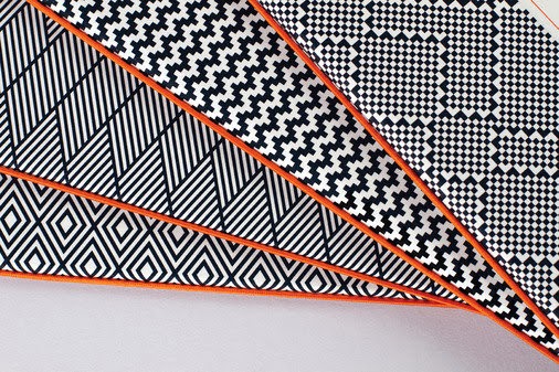

Here is another example of monochromatic patterns but with a more varied selection of designs. I like these as they have a more detailed appearance whilst still being constructed from simple block shapes. The high contrast of the black and white make the shapes and patterns really pop and stand out clearly.


These examples have a more collaged approach and although I really appreciate the incorporation of photography aesthetically, I don't feel that this is something that will be appropriate with my own designs. However I feel that this general idea could work applied over a more detailed pattern design, especially with the top example as the main design could be broken up into sections


I love the bold colours and shapes from this wine bottle branding. I think it is interesting how in some examples the shapes cross which causes a change in the colour with a transparency effect. How the bottle is black is also very important as it allows the pattern to be at the forefront of the design.


Forma & Co
The bold lines for these publication covers are very effective and would be extremely eye catching to an audience. The colours used are very exciting and I like how they have been broken up with the strips of white as I think it really enhances how they appear on the page.


Sandra Fettingis
These pieces are sculptures but I still feel that they are extremely relevant to my research due to the use of shape and colour. The physical layers of the structure could easily be replicated digitally and have a similar effect. Because these are three dimensional the shadows also bring another dimension that wouldn't normally be considered.


These are extremely simple examples of geometry but I feel that they are very successful. I think designs like this would work with my own work as I am planning to apply them onto something more detailed so a simple pattern would be needed in order for it to not look overly busy and cramped. I think the use of white space also enhances this work.


I love how these patterns have been applied to more unusual objects and something that wouldn't normally be expected. With the print being on the shoe it gives a whole new context and makes you look at it in a new way. I also like how the pattern has also been used in the background as it makes the composition a lot more intense and interesting.


Patternity
I love the effectiveness of this crockery and how by using such simple techniques can create such impact. By placing shapes within each other and inverting the colours of the lines creates an appearance that is extremely engaging to look at. The use of colour is very chic and the crisp navy and white gives a strong luxury aesthetic.


Patternity
This is another example of how geometric prints can be applied to items that it isn't normally associated with. I think this is interesting to look at as the area it has been applied on here is very different therefore altering the composition. I think the packaging fits very well as the long narrow tube replicates the shape of the legs.
No comments:
Post a Comment