


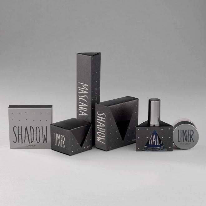

Sarah Thorne
I like how the design for these Topshop makeup collections remain consistent but still have a unique aspect that makes them stand out from previous seasons. The hand rendered aesthetic is really interesting and also relevant to the target audience. The style and shapes of the nets themselves are also interesting and the quirky shapes really enhance the design, along with the foiling to bring attention to the prints.
Paul & Joe


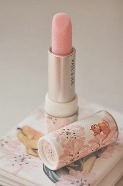


The illustration style of this Paul & Joe packaging really appeals to me as I love the detail and I feel it gives the products a very luxurious and desirable appeal. The individual look of each product gives great shelf appeal and would encourage people to buy not only for the quality of the product but for the design. Although this is a look I really admire I feel that it isn't an aesthetic I would do myself as it doesn't fit my style of design as this isn't where my skills lie.
Hybris


Dafna Aizenberg
The design of this packaging is very bold due to the block colour and typeface. I really like the unique approach to how the items have been packaged as they look really interesting to interact with, although I feel that for a collection one style could have been selected to create a consistent look. I love the use of foil as I think it appears to be very luxurious and would capture the audiences attention.
Albeit


The simplicity of this packaging makes it appear extremely elegant with limited fuss due to understated pattern and typography. I also feel the colour palette of crisp white and foiled gold adds to this aesthetic and really creates an identity for the product. I feel that this is a look that would inspire my designs as it something that really appeals to me.
Aschen and Voss


Established
The structure of these products are really different and have a strong geometric appearance with clean lines and angles. The colour palette is on a whole quite neutral and muted but the contrast is provided by the bright pink. The main design aspect of this collection is the shape as the type is very subtle. This has shown me that the structure is something very important to consider.
Marc Jacobs


I feel this collection has the look of something really expensive due to the crisp white on black and minimal typography and fuss. Although one aspect I don't like is the curved edges of the products themselves as I prefer the more angular appearance.
Marena Beaute


Bold
I love this collection of products as I think it has a great balance between decorative aspects whilst still keeping a clean and luxury aesthetic. The bronze is really successful as I feel it compliments the grey and is also a more unique foiling choice. I also like the contrast between the two typefaces as I think it really adds interest to the composition.
Uzuri


Dinoplatz


Crosspoint
The colour palette is what initially drew me to this collection as I love the fresh look of the mint green and white. It also has a strong hand rendered appearance with the quirky illustrations and hand rendered type. The way certain aspects pop up is very interactive and a way to get the audience to react with it. Although I like this packaging I feel the style isn't relevant for what I'm trying to achieve.
& Other Stories


& Other Stories
Kate Spade
No comments:
Post a Comment